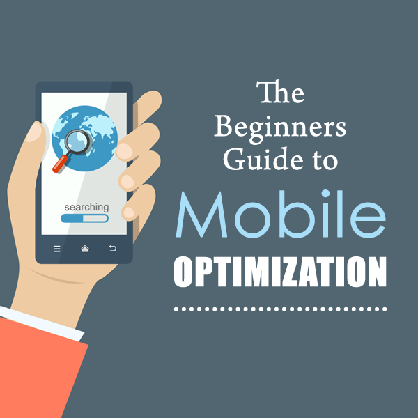
The Beginners Guide to Mobile Optimization
John McDougall, John Maher, and Pavel Khaykin of McDougall Interactive discuss the basic tools, plugins, and strategies for mobile optimization—an increasingly important field as more web searches take place on phones than on desktops. Learn what you can do to make your website as mobile–friendly as possible.


So any opening thoughts on that John? Before we dive into some ways that you can help to make your site more mobile friendly and do optimization on your mobile site?
Mobile Optimization Overview
It says that “factors such as load time, file size, HTTPS encryption for shops, internal links, page architecture and mobile friendliness are elementary pieces of the puzzle in general; perfect technical implementation lays the foundation of breaking into the top 20, but long term success in the upper echelons of the first results page is achieved by offering content that matches the relevant user intention.”
So technical stuff like mobile optimization is really important, it’s not going to get you to number one in Google just because you load faster, or have a nice, responsive site. But it’s a prerequisite–you need that now as a foundation.
Tools for Testing Your Mobile Optimization
One thing to note is that, it’s only testing that one page. So, if you put in your domain name, it’s going to check your home page and see whether or not it’s mobile friendly, but that doesn’t necessarily mean that all of your inner pages are mobile friendly as well. So, you want to make sure that you go and put some of your…especially your main category pages, your product pages, services pages, whatever–make sure that all of those are mobile friendly as well.
It’s a free tool, but you do have to sign up for it and it will give you some verification code that you have to put into your website to verify that you are the owner of the site. Then, it gives you lots of great information, and anybody who’s doing any kind of search engine optimization type of work for their website should be using the Google Search Console.
But in particular for mobile optimization, there is a tool in there called Mobile Usability. If you go to that report it will show you any errors that Google is picking up for your mobile usability on your site, and then any errors that you see you can go off and try to fix those.
Mobile Optimization and Page Speed
You go to gtmetrix.com, you put in your url, and it will quickly give you a score: One prospect–I was looking at a bank website the other day–they had a score of an E and an F. Really low grades for the quality of their mobile speed. And then GTmetrix will give you a bunch of items, usually at the top, you’ll see the way you’re getting F’s. Maybe you’re not specifying the image dimensions of your images-
Again, looking at this bank website the other day, it had a 14 second, over 14 second load time. Not good. It’s a brand new website too. They just launched it few months ago, so lots of technical errors; I won’t go into all the details but 301 redirect errors, their pages are not showing up right in the search results and they have a real slow load time. Way to go web design company. Don’t mean to dump on them but that’s not good. Those foundational elements for mobile [optimization] are going to really dictate whether you’re able to successfully do content marketing.
WordPress Mobile Optimization
One of my favorite plug-ins is W3 Total Cache. The good news is that it’s free. But the kind of downside is that it does take a little bit of configuring to do. So you can definitely try installing it, but then I would advise that you work with a developer to make sure that the plug-in is configured correctly with your website, to make sure that all the settings are set up because what it does is basically consolidate all of your code. Your CSS code, your java script and consolidate it all into one — into smaller chunks to minimize the size of your webpage, and it does the same thing with your images.
With pretty much everything. There are a lot of different settings that you need to configure but it really has worked well. We’ve used them on a couple of clients and we’ve had great success. We were able to make really substantial improvements, taking the page speed from sometimes by three to four seconds in terms of improvement. That’s one plugin I love to use, another one is WP Smush It, so often times…
This plugin, what it does is it takes all of your images and it compresses them automatically. Every time you upload a new image, it will compress that file and decrease it sometimes by as much as 70%, so that you don’t have worry about compressing it yourself. The plugin does all the work for you. But again it requires proper configuration to make sure that it does not break your website or you don’t create any additional issues. You have to be very careful how you configure those plugins so that they work collectively together to accomplish the goals.
Mobile Optimization for Non-WordPress Sites
Mobile Optimization in 2017
But with that said, on a phone you might not be as likely to sit there and use your index finger on your iPhone and read 2500 words. The world is going quite a bit to video and podcasts and things where you should have at least a good chunk of that content for the people that are even on a phone, not just a tablet. I will say mobile optimization isn’t just load time and file size and all these geeky things: it’s giving good content that people would want to check out on the phone.


Leave a Comment!