Be Careful with Adding Images to Your Site’s Design

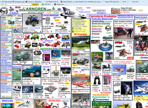
The infamous image cluttered website Arngren.net.
There’s a couple reasons why you should avoid adding too many images to your business’s website. 1st reason is Google’s spiders can still not fully understand what is going on in an image, and 2nd reason is the more images you have the site the slower it is going to be (generally).
Images with text
Does your website have a lot of images with text in them? Even with optimized alt tags, title tags, and file name, search engine spiders can still be confused about what the image on your page is about.
Something that is common — and when changed can benefit the business a lot — is the classic image of the phone number in the header or footer. It’s important that the phone number is text and not an image. That number gives Google a lot more indication of who your business is, and if you have it in an image (even with alt/title tags), it’s not nearly as powerful as having it be just text (something Google understands no problem).
Design vs. page speed
There’s a big war that’s been going on for awhile between business owners doing their own design vs. developers/marketers who are making the website. Business owners usually want to clutter up the design and the developer/marketer wants to cut all the crap out to make the website quicker and more user-friendly. I agree with the developers here, and the quicker you make your website for users the quicker Google may reward you for it. At least that’s the direction, and you can see it here with recent reports from Matt Cutts like this or this video coming out:

If your business website has a lot of images in the theme or images with text on them that you can easily turn to HTML/CSS, then this could be an easy strategy to apply for improving your organic search traffic.


Leave a Comment!